 NewsLoop
The app builder
Design your app's screens, menu and colours in the admin, then publish. Readers' apps pick up the new layout the next time they open, without a new release in the stores.
Go to App → App builder. You need the "Design and publish the mobile app" permission; admins have it.
The screen

- The toolbar: undo and redo, Android or iPhone, light or dark, the preview language, Templates, Versions, download and open, Save draft and Publish.
- Add and Screens: the components you can add to a screen, and the list of the app's screens.
- Menu, Theme and App settings: the app's menu, its colours and fonts, and settings for the whole app.
- The phone: your layout with your real articles. Tap the tabs at the bottom to switch screens.
- Settings: whatever you selected: a component, a screen, the menu or the theme.
A walkthrough in pictures
This is the whole workflow, from changing a screen to publishing it to readers' phones. Nothing reaches readers until step 7.
Step 1: choose a component and change it
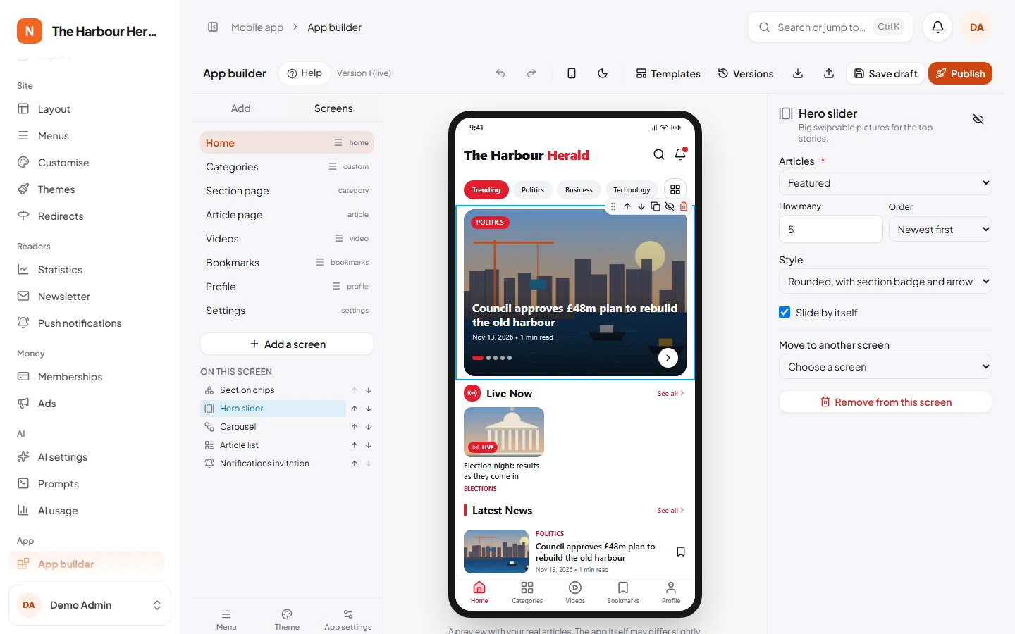
Click a component on the phone, such as the hero slider at the top. It gets a blue outline and a small toolbar (drag, move up, move down, duplicate, hide, remove), and its settings open on the right: which articles it shows, how many, in which order, and its style. The phone shows each change at once.

To add a component, click it under Add on the left (it goes after the selected one), or drag it onto the phone.
Step 2: the app's screens
Screens lists every screen of the app: home, sections, articles, videos and your own pages. Click one to show it on the phone and change it. Add a screen adds one; link it from the menu in the next step.
Step 3: the menu
Menu (at the bottom left) chooses how readers move around: tabs at the bottom, a side menu or tabs at the top, with up to six items. Each item has a label, an icon and the screen it opens.

Step 4: colours, fonts and logo
Theme sets the colours for light mode and for dark mode, the fonts, the rounded corners and the spacing. App bar, at the bottom of the panel, chooses the logo. See Customization guide: the app for your brand colours step by step.

Step 5: settings for the whole app
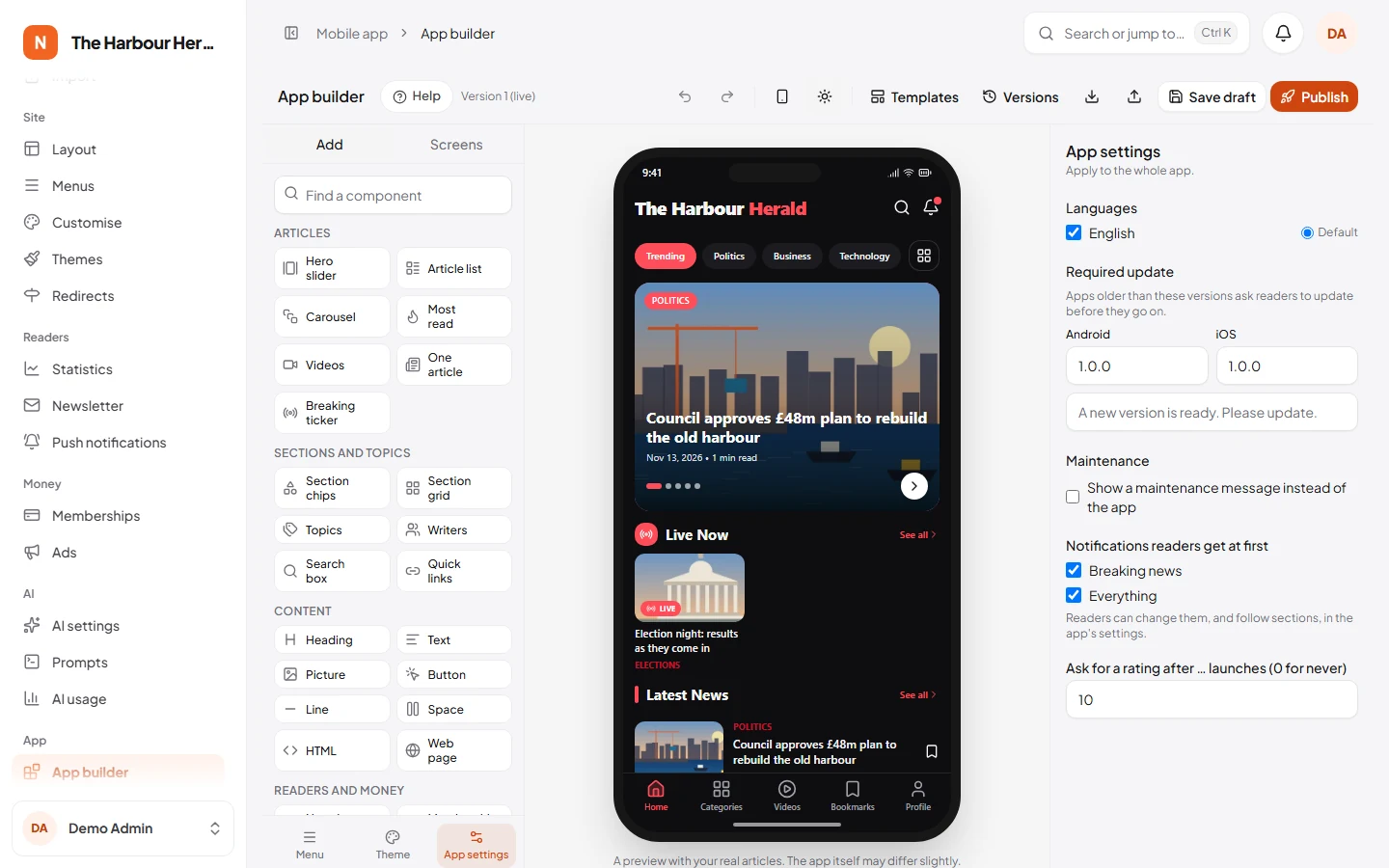
App settings has the app's languages, the oldest app version readers may use, a maintenance message, the notifications new readers get, and when to ask for a rating.

Step 6: check it on iPhone and in dark mode
The two buttons left of the language switch the phone between Android and iPhone, and between light and dark. Check both before you publish.
Step 7: publish
Click Publish. The builder checks the layout first:
- "Everything looks right." means it is ready. Write what changed if you like (it shows in Versions), and click Publish.
- Problems that would stop the app, such as a menu item for a deleted screen, must be fixed first: click one to go to it. Warnings, such as an empty screen, are advice only.
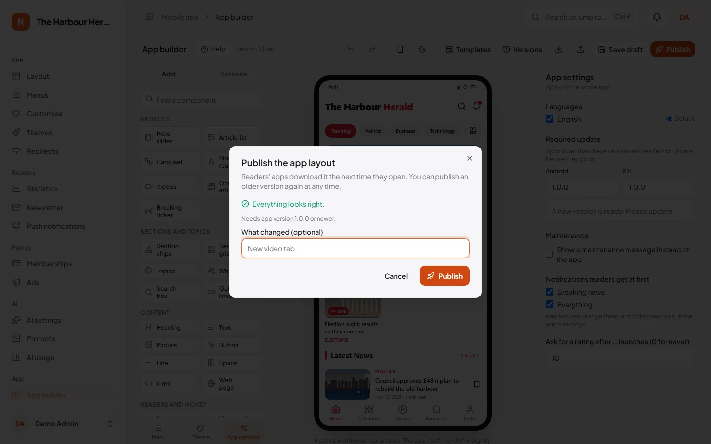
Readers' apps use the new layout the next time they open, with no store update. To undo, open Versions and publish an earlier version again.
The result on a phone

Building a screen
- Drag a component from the left onto the phone, or click it to add it after the selected one.
- Click a component on the phone to change it on the right: which articles it shows, its heading, its style.
- Drag the handle to move a component, or use the arrows. Hide a component to keep it without showing it.
Components
| Group | Components |
|---|---|
| Articles | Hero slider (headline on the picture, rounded with a section badge, or under the picture), Article list (cards, rows with a save button, compact, grid, magazine), Carousel (cards, pictures with the headline under, numbered for the most read), Most read, Videos, One article, Breaking ticker |
| Sections and topics | Section chips, Section grid, Topics, Writers, Search box, Quick links |
| Content | Heading, Text, Picture, Button, Line, Space, HTML, Web page |
| Readers and money | Newsletter sign-up, Notifications invitation, Membership invitation |
Article components take their articles from a source: latest, featured, most read, breaking news, editor's picks (the website's Editor's picks block), a section with its subsections, a tag, a writer, a series, videos or live blogs. Choose how many, and the order.
Two sources depend on the page: This section lists the section a section page shows, and Related articles lists articles related to the one an article page shows. The builder warns if they are used elsewhere, and previews them with a section or article you choose in the screen's settings.
Article lists and carousels can have a heading with a coloured bar or an icon, and "See all". The Heading component has the same styles and can link its "See all" anywhere. Section chips can start with a chip of your own, such as "Trending" or "All", end with a button to every section, and on a section page show the sections inside it.
Buttons, pictures and quick links can open a screen of the app, an article, a section, a tag, a writer or a web page.
Screens
Screens → Add a screen. A custom screen shows only your components. Built-in screens add the app's own content under your components:
| Screen | The app shows |
|---|---|
| Home | Only your components; the app bar shows your logo |
| Videos, Live | Video articles or live blogs |
| Search | Search |
| Saved | The reader's saved articles |
| Account | Sign in, membership and newsletter |
| Settings | Theme, text size, notifications, language, privacy and about |
| Section page | The section's articles under your components. Turn off Show the app's own list of articles to build the page from components with the source "This section" |
| Article page | The article, then your components under it. Its settings choose a section badge on the picture, a picture count, tags, likes with comments and share, and tinted quotes |
| Welcome | Shown once, when the app is first opened |
Any screen can show its title large under the app bar, with the logo in the bar. The app opens section and article pages itself, so they need no menu item.
Menu
Choose tabs at the bottom, a side menu or tabs at the top, and up to six items. Each item opens a screen, with its label and icon.
Theme
Colours for light and dark mode, the text and headline fonts, rounded corners and spacing. The app follows the phone's light or dark mode unless you choose one.
App bar chooses the logo: your uploaded logo, the site name, or the site name in two colours (for example "News" in the text colour and "Loop" in the main colour). It also chooses the buttons on the right of the home screen: search, notifications and saved.
App settings
The app's languages and default language, the oldest app version readers may use (older apps ask to update), a maintenance message, the notifications new readers get, and when to ask for a rating.
Languages
Every text has a version per language. Switch the preview language in the toolbar to edit and see another one. Other languages under a field shows the rest; the app falls back to the default language when one is missing.
Saving and publishing
- Your work is saved as a draft a few seconds after each change, and with Save draft or Ctrl+S. Readers see nothing until you publish.
- Publish checks the layout first. Problems that would stop the app, such as a menu item for a deleted screen, must be fixed; click one to go to it. Warnings, such as an empty screen, are only advice.
- If a colleague saved the draft while you were working, the builder says so instead of overwriting their work. Reload to see their changes.
Versions
Versions lists every draft and publish, with who and when.
- Compare shows what changed between a version and your screen.
- Carry on from copies a version into the draft.
- Publish makes an earlier version live again, to undo a publish.
- Delete removes old versions. The live one cannot be deleted.
Templates
Templates has six complete layouts: NewsLoop, Classic, Magazine, Video first, Minimal and Local news. Using one replaces your layout (you can undo it); your articles, sections and languages fill it in.
NewsLoop is the standard look, and the layout the app uses until you publish your own: red accents and a two-colour logo, section chips, a rounded top story, live coverage, latest news with save buttons and a notifications invitation. Section pages have a large title, the sections inside, the top story, the articles and the most viewed. Articles have a section badge, a picture count, tags, likes, comments, share and related news. Tabs: Home, Categories, Videos, Bookmarks and Profile.
Files
Download the layout as a JSON file to keep a copy or move it to another site, and open one to bring it back. Opened files are checked like any other layout.
Keyboard
| Keys | Does |
|---|---|
| Ctrl+Z, Ctrl+Shift+Z (or Ctrl+Y) | Undo, redo |
| Ctrl+S | Save the draft |
| Delete | Remove the selected component |
| Ctrl+D | Duplicate it |
| Alt+↑, Alt+↓ | Move it |
| Esc | Deselect |
App icon and splash screen
On App → Mobile app, choose the app icon (a square PNG or JPEG of at least 1024×1024, without transparency), the splash screen logo (a PNG at least 512 pixels wide) and the splash colour. They go into the app when it is built for the stores, so changing them needs a new release.
For developers
The layout format is described in resources/schema/app-config.schema.json. After changing it, run npx pnpm@10 run schema:types and update the component registry in resources/js/builder/registry.ts; the tests (npx pnpm@10 run test) point at anything missing. The published layout is served at GET /api/v1/app/config.